Pathway to Sustainability

Art Direction

Designing clarity into complex sustainability content.

Environmental awareness poster with ripple graphic and message ‘A drop in the ocean
 making ripples’, part of wider sustainability design series.

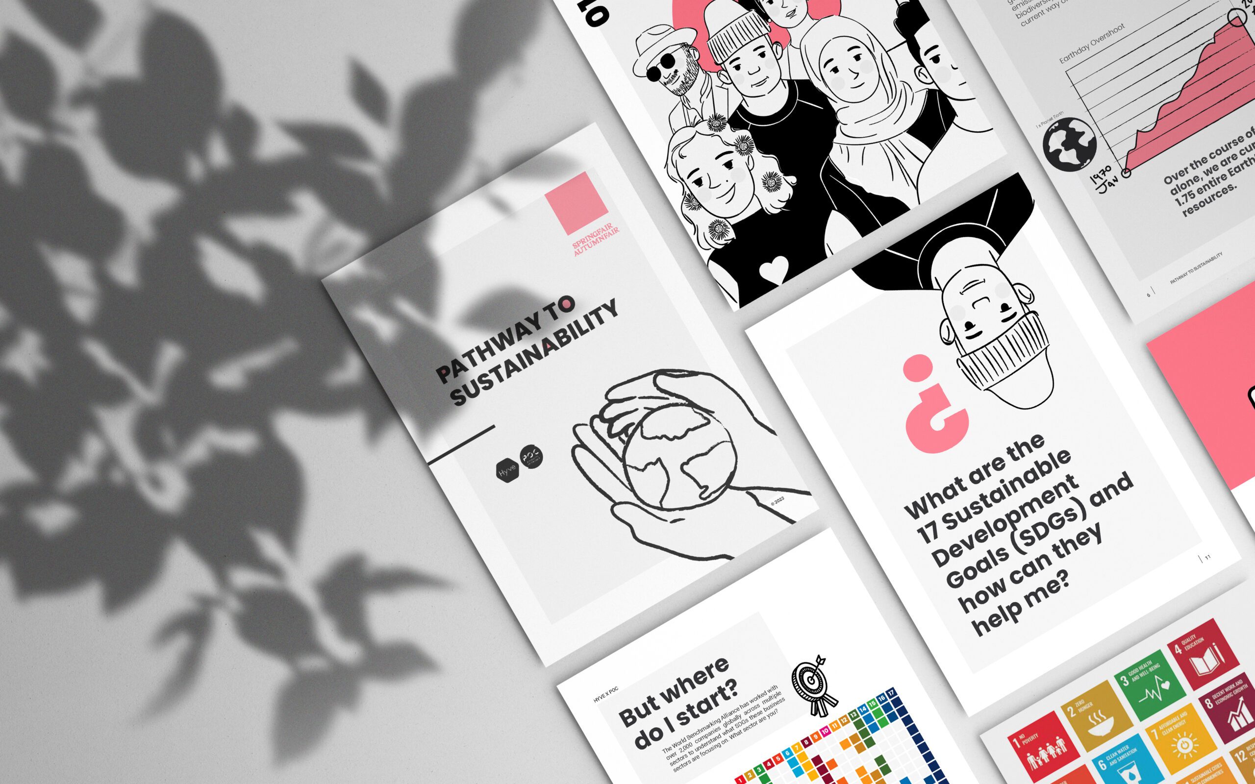
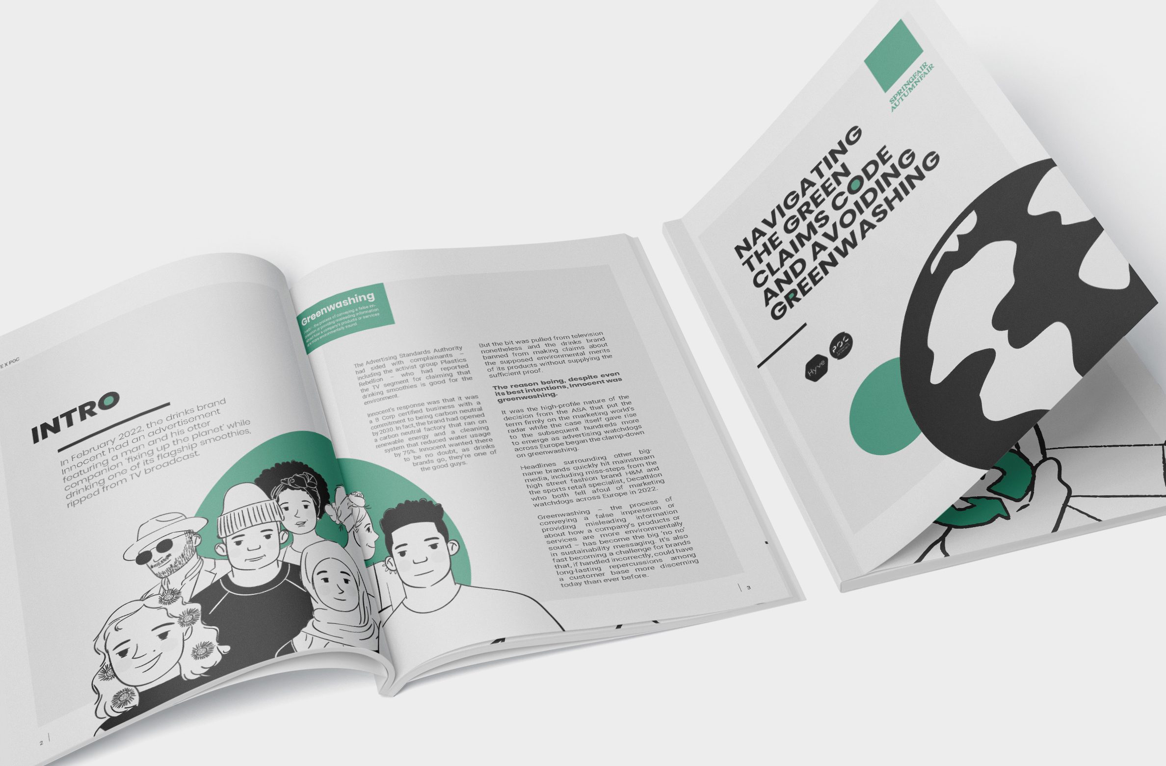
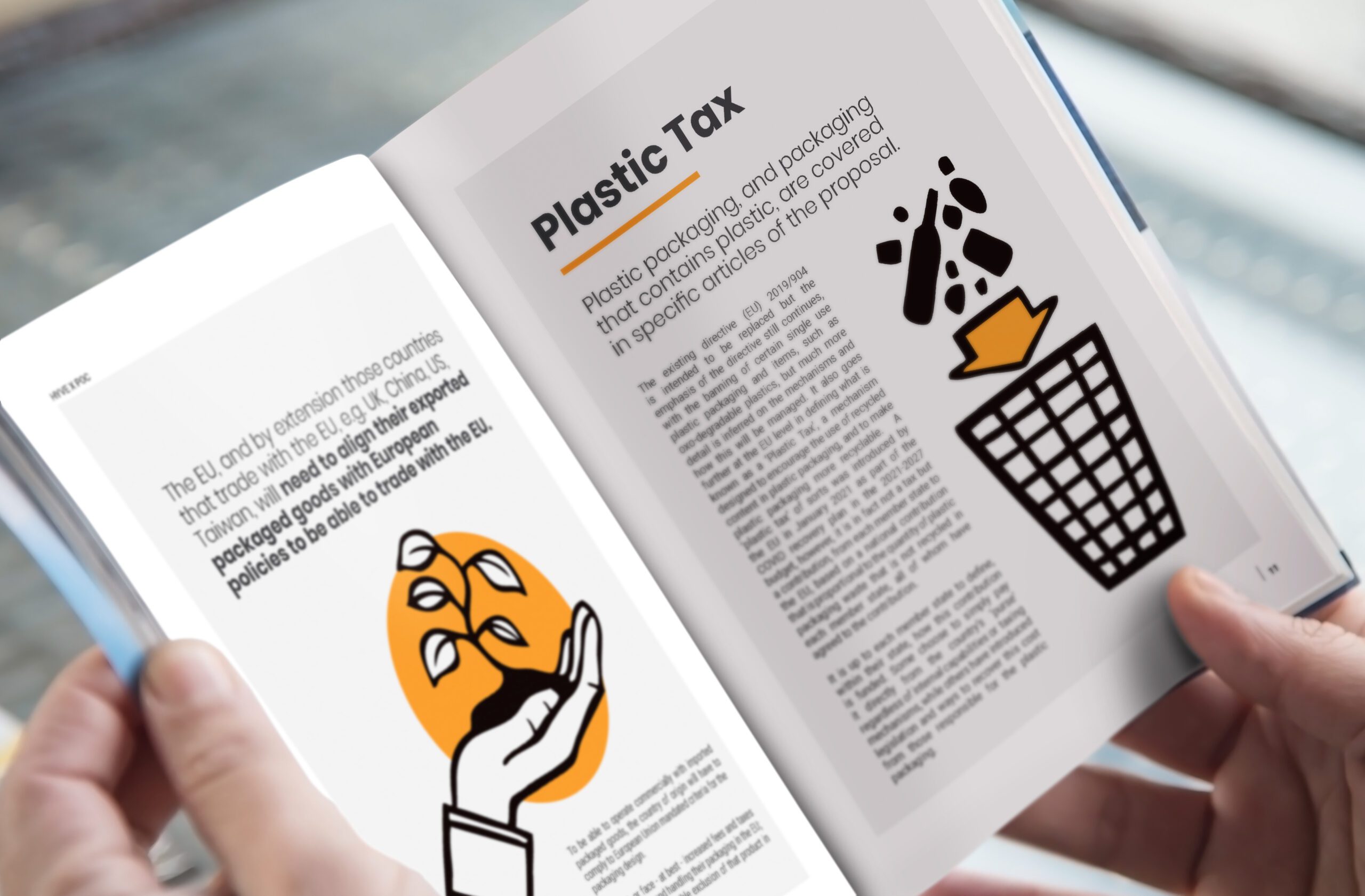
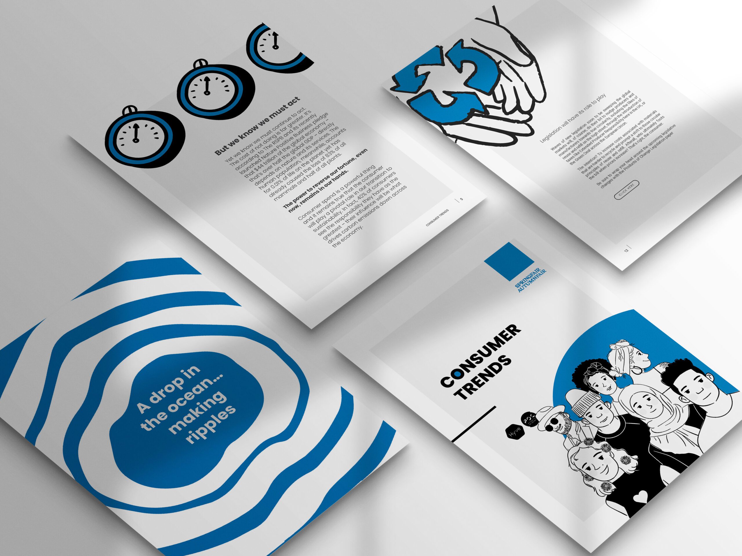
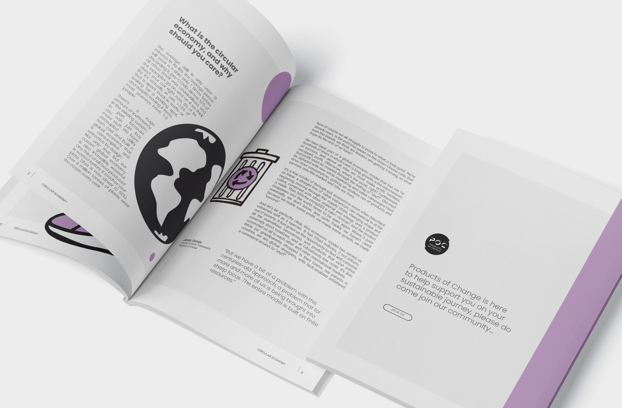
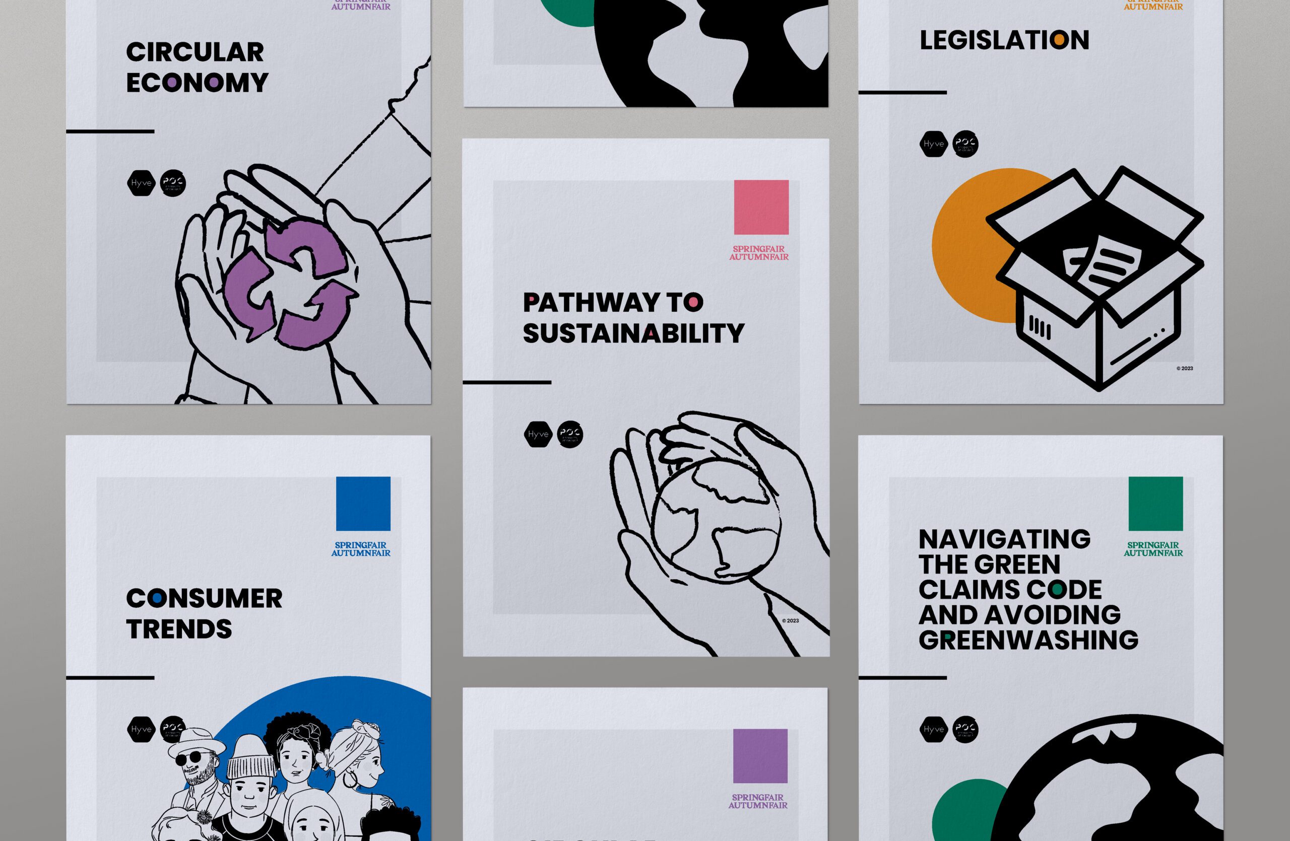
Hyve Group and Products of Change developed a five-part white paper series to help retailers and producers navigate sustainable business practices.

The goal was to make policy-heavy content feel clear, useful, and worth reading.

Role:
Creative Lead, NOSY Creative Agency

I led the art direction and layout design for the full 72-page series. Each paper focused on a different theme, from the Green Claims Code to consumer behaviour, the circular economy, and the UN Sustainable Development Goals.

Visually, the documents needed to feel joined-up without being repetitive. I developed a flexible but consistent layout system that carried across all five papers, adapting illustrations, icons, and colour use based on the subject matter. It was important to balance visual clarity with enough warmth to keep the reader engaged.

This work helped Products of Change raise the bar for how guidance and legislation can be presented without compromising clarity.

Role:
Creative Lead, NOSY Creative Agency

Cover design for the ‘Pathway to Sustainability’ white paper, featuring a hand-drawn globe illustration and clean, minimal layout.
Introductory spread from the Green Claims Code white paper, featuring diverse illustrated characters and a clear, accessible layout.
Double-page spread from the sustainability white paper series, breaking down Plastic Tax legislation with clear layout and custom illustration.
Interior and cover design for the ‘Consumer Trends’ white paper, featuring iconography, clean typography, and a blue ripple visual.
Double-page layout from the Circular Economy white paper, combining minimal typography, clean composition, and illustrative planet graphics.
Overview of the five-part sustainability white paper series designed for Hyve Group and Products of Change, each with distinct illustrations and colour accents.

Related Projects

Joe Redston brand identity – visual cover showing dual-colour symbol on abstract urban background

Raise Global

Brand Identity

Urban digital billboard at night displaying the WRS tagline “One system, every possibility” with pink and purple brand arcs.

WRS Rebrand

Brand Strategy | Identity System

Close-up of a person’s wrist covered in colourful fabric event wristbands, representing past music festivals and Innovation Events experiences.

Innovation Events

Creative Direction