Raise Global
Brand Identity
Clarity and balance between a personal brand and its purpose.
Joe Redston is a coach, writer and speaker working in leadership and team dynamics.
He came looking for clarity.
Role:
Creative Lead, NOSY Creative Agency
Client:
Joe Redston / Raise
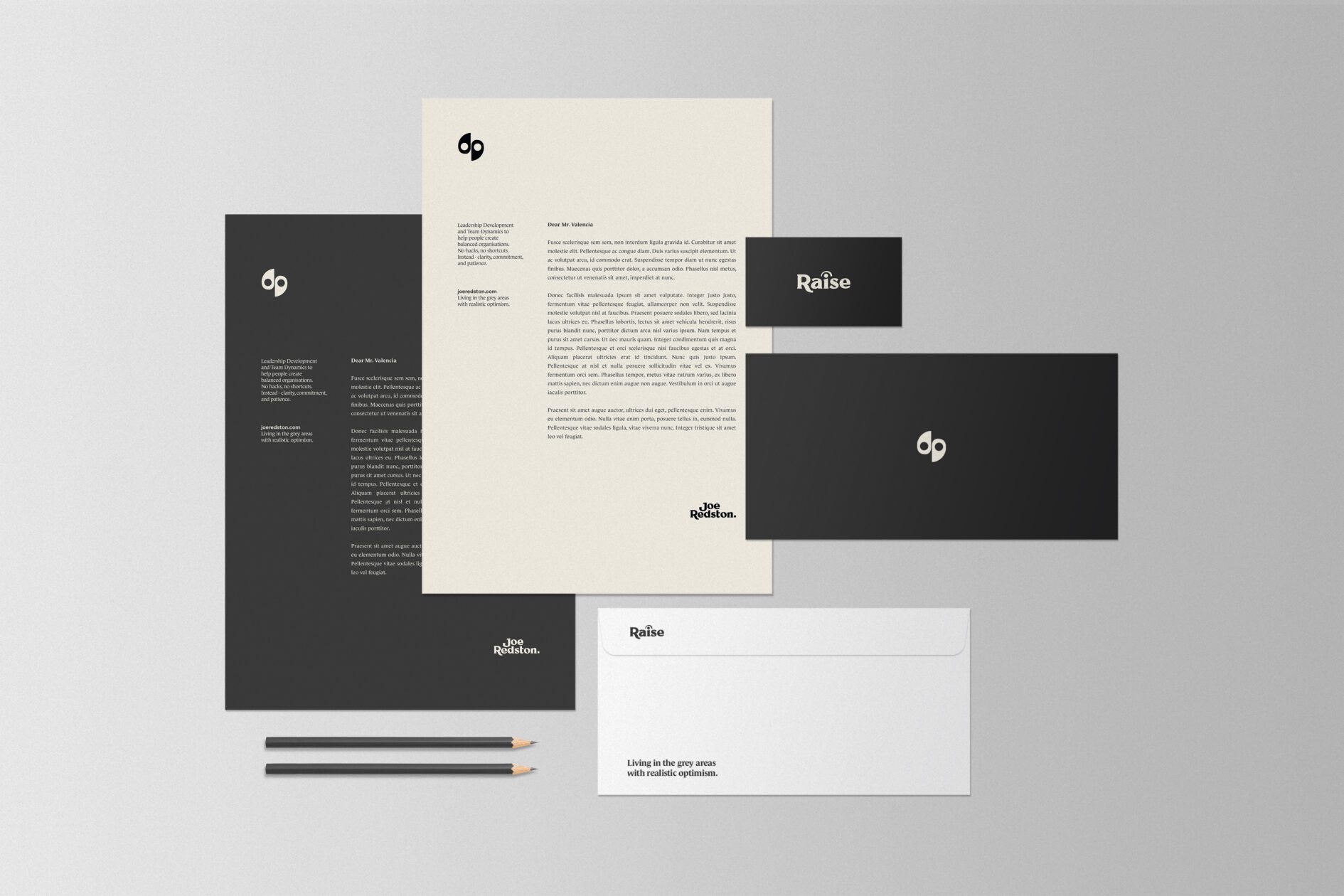
His personal brand and his business, Raise, had started to overlap. The challenge was to define them clearly, without breaking the connection between them.
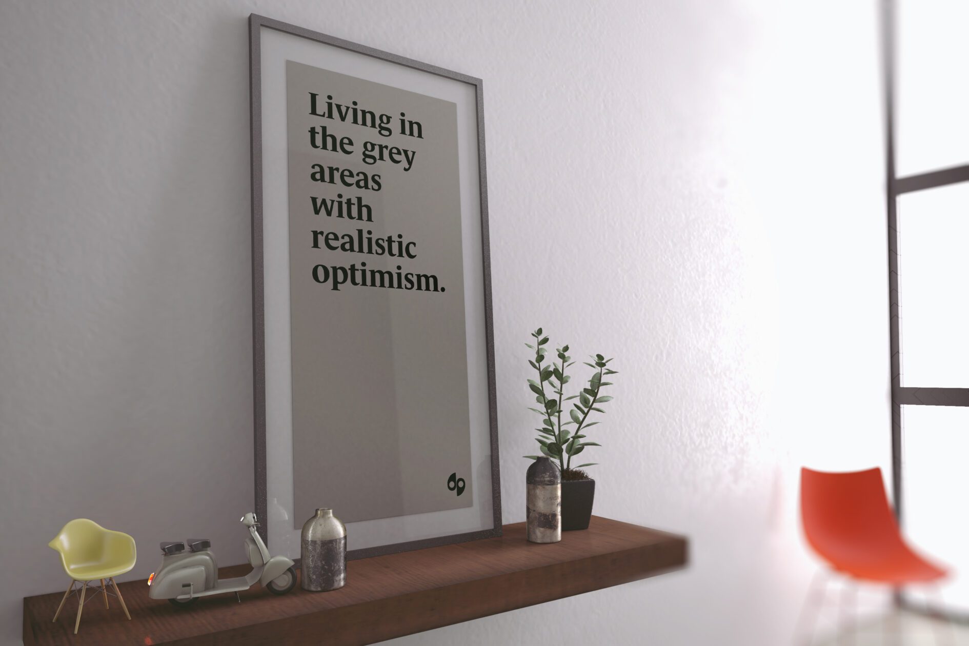
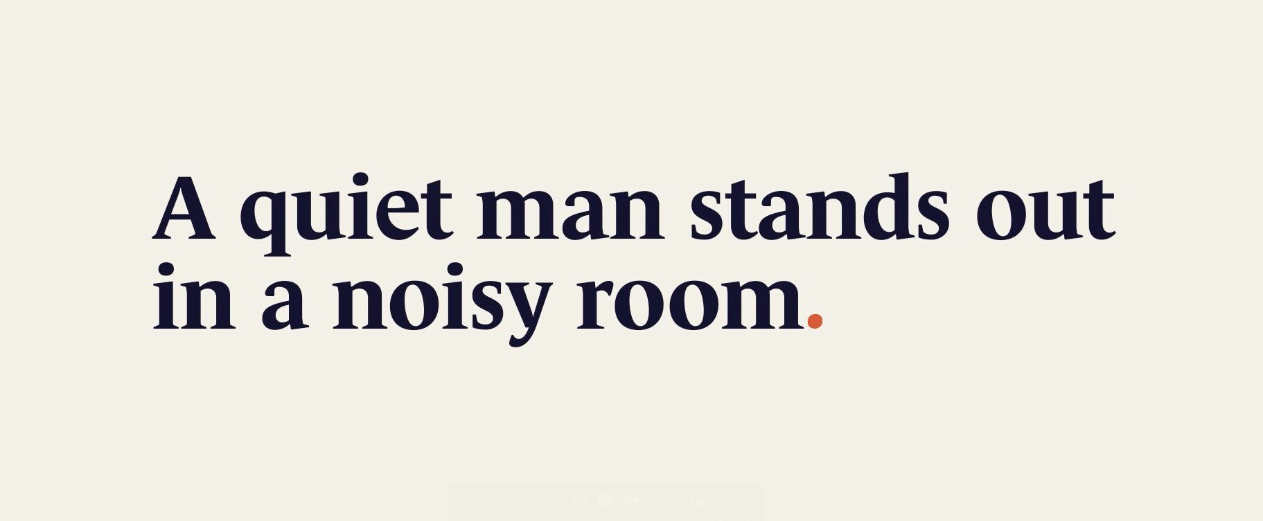
The work began with discovery. Workshops, conversation and research to get to the heart of how Joe thinks and what he stands for. He values structure, calm and balance. He didn’t want noise. He didn’t want to look like everyone else. He wanted a brand that felt intentional.
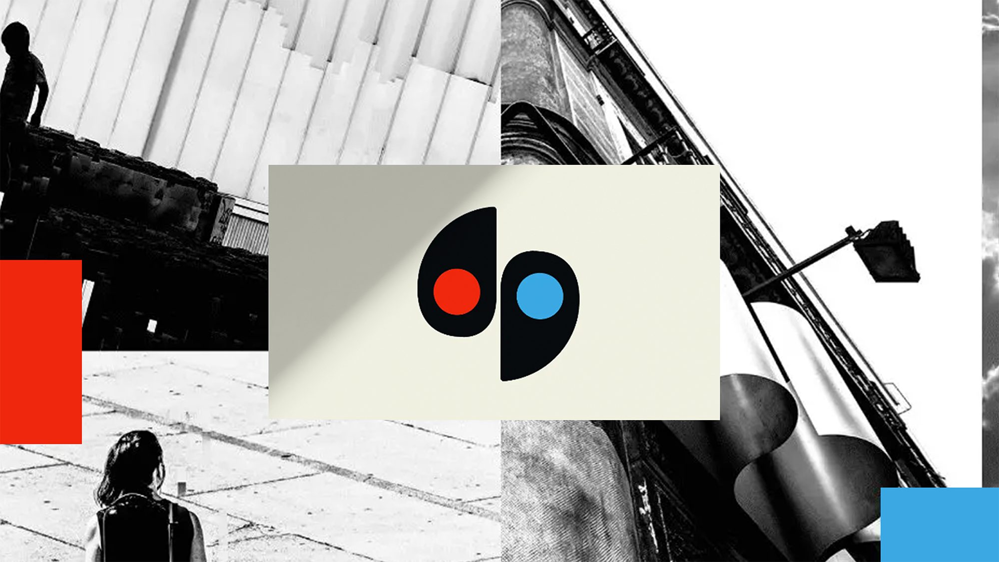
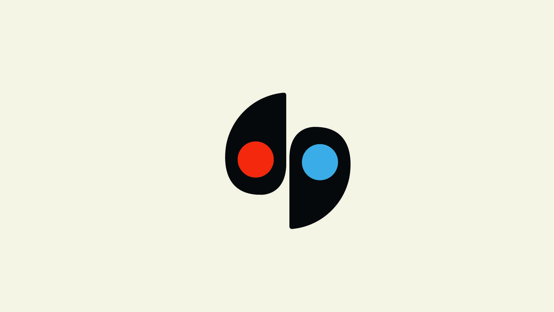
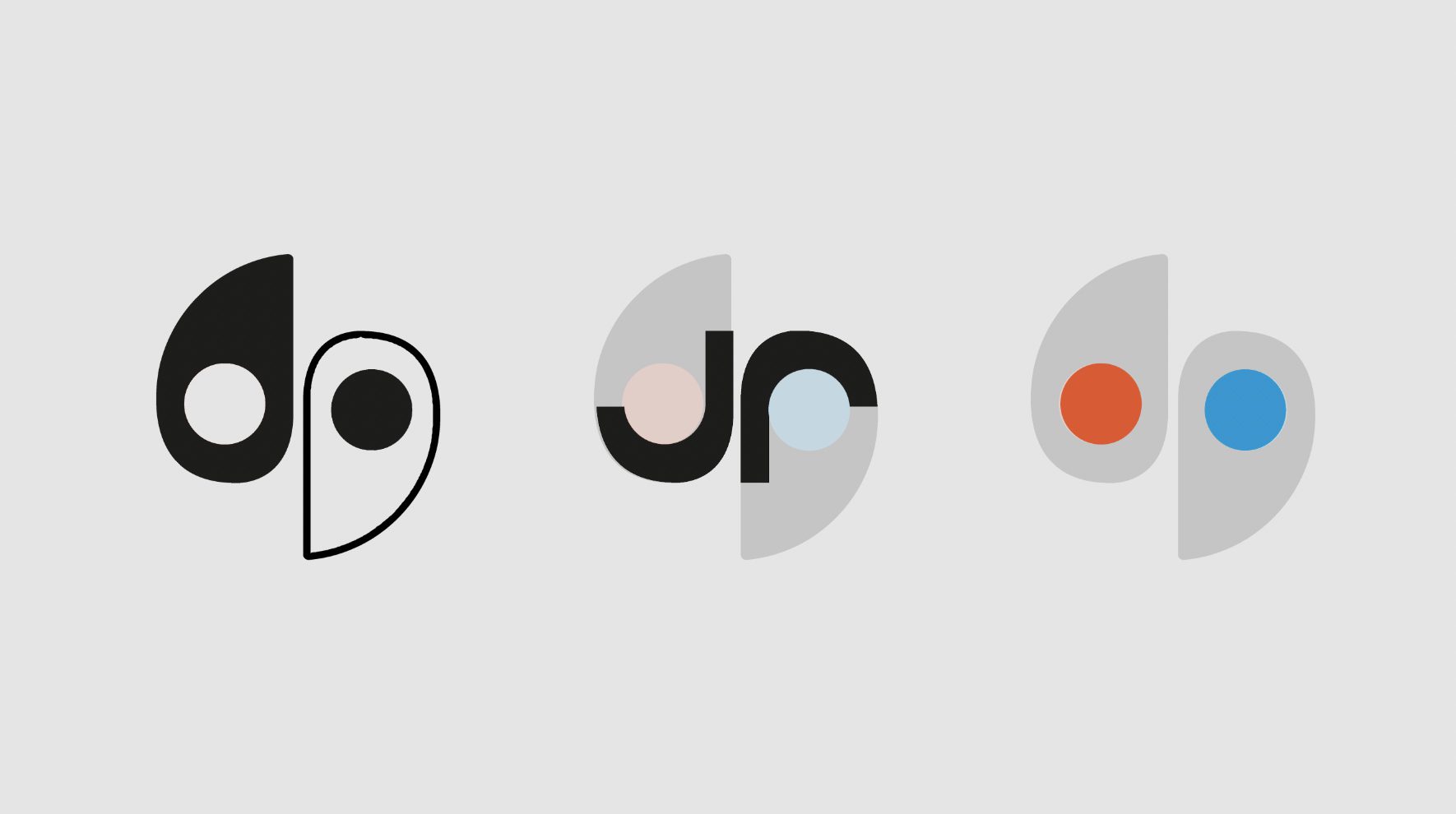
What emerged was a system built around two identities — one for Joe, one for Raise. Distinct but aligned. The shared symbol reflects that relationship. A calm, balanced form with hints of a yin-yang, a monogram, and two tones: orange for Joe, blue for Raise.
The rest of the brand follows that principle. Quiet. Measured. Built to hold space without needing to shout. It reflects how Joe works and gives him the tools to move forward with clarity and confidence.
Role:
Creative Lead, NOSY Creative Agency
Client:
Joe Redston / Raise


Related Projects
Pathway to Sustainability
Art Direction
WRS Rebrand
Brand Strategy | Identity System
AOP ICON
Brand Identity